Painting the Earth
Coming into remote sensing, one of the aspects of geospatial analytics that is super important is learning how to read maps. Now I don’t mean learning how to read a traditional map of the world (although understanding the different projections is, in my opinion, essential. I’m referring to how to interpret a multi-colored extravaganza of an image that you might see at a poster conference or online somewhere, one that’s so mesmerizing to inspect you tend to forget why you were looking at it in the first place…maybe that’s just me.
But first let’s do some definitions, especially because I tend to forget about these more than I’d like to admit.
Satellites: the main system that is orbiting the Earth. Satellites do not measure or collect data themselves.
Instruments: The things that do get data. Think of a satellite like a bus, and the instruments are the passengers. So for example, Landsat 8 is a satellite with OLI/TIRS instruments on board.
Bands / channels: These are the sections of wavelengths that an instrument measures. See the Landsat 9 band image below.
Part of the way we visualize satellite imagery is selective visualization of the different wavelength bands. In other words, orbital sensors are sensitive to various wavelengths of electrogmangentic radiation, and the absolute and relative values of those various values give us clues about Earth’s surface condition. Let’s take the OLI/TIRS instrument aboard the Landsat 8 satellite, for example. From this website, we can see it has 11 bands (different wavelength ranges), with varying spatial resolutions.
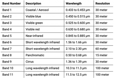
Fig. 1. Landsat 8 Bands
Since the majority of spectral bands are 30 m, we commonly refer to Landsat 8 imagery as having 30 m resolution. When most of us think of satellite images, we envision what we would expect to see if we were in an airplane above the area, such as these images from NASA. Images like this are made up of only the red, green, and blue bands (RGB).
But what about all these crazy, sometimes psychedelic (false-color compositing) images we see, like this? As much as we like to look at these ourselves, surely there’s some benefit to seeing the Earth in this way?
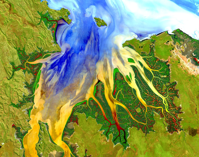
Fig 2. Source: https://www.satimagingcorp.com/gallery/landsat-8/landsat-8-enhanced-land-mapping/
Thankfully yes, but a large part of it relies on how we create the visualizations (given my experience in R, I’ll be explaining from that angle based on this great guide from the National Ecological Observation Network (NEON)). When we try to show a satellite image in R, we use the “plotRGB” function from the raster package when we want to show color composites (be they true color or not), which gives us three options for specifying which bands to show. This is similar to your computer monitor and TV screen (if you get super close to your TV, you can see the individual red, green, and blue lights that comprise a single pixel).
Wait a second. How does that make sense? Mixing those colors only gives us subsequently darker colors, right? We’ve all learned that from kindergarten and using crayons. Well, it turns out this is a different color model altogether. What we learned in kindergarten using fingerpaint still holds true for physical paints, but these colors on screens are light (as in speed of light), and are part of an additive color model. With something like this, red plus green doesn’t equal some sort of brown, but instead gives us yellow, and all the colors together end up producing white (1). For an example of this, see this description of the Maxwell tartan, the first-ever color photo from 1861!
1 – Note: The CMYK model is what your printer uses, and refers to cyan-magenta-yellow-black. Just as RGB gives us all the colors when we talk about light, CMYK gives all the colors when printing.
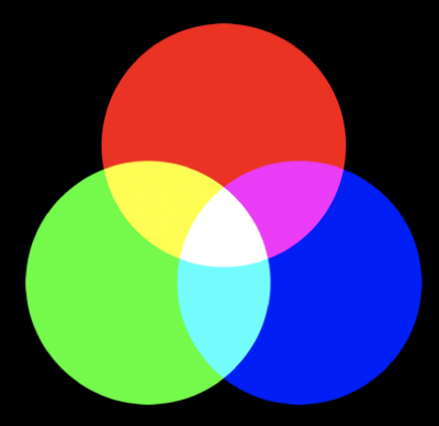
Fig. 3. Additive Color Wheel
So how do we interpret an image? Using this great NASA website I wish I had found earlier, a true-color image – as I referenced above – is a satellite image plotted with the red:red, green:green, and blue:blue bands. Red areas are those reflecting more red, and green areas are those reflecting more green, etc. That’s cool for true-color images, and we can easily understand what we’re seeing; after all, we assign red to the red display channel, green to green, and blue to blue. However, there’s nothing stopping us from assigning any wavelength range to any color display channel, and this ends up giving us non-natural colors. Aside from attention-grabbing, these non-natural color images allow us to emphasize certain land cover conditions and/or reveal things that we can’t see with our own eyes. To give a better picture of this, note the placement of the red, blue, and green squares in the visual below: all three are clustered in smaller wavelengths compared to the overall range that can be sensed by satellite instruments. This placement also covers the electromagnetic region that our eyes are sensitive to (in other words, it covers the colors we can see). Fun fact is there are many animals that can see different wavelengths than humans can, e.g. snakes (see this site).
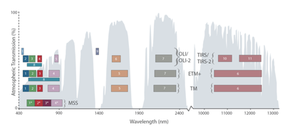
Fig. 4. Taken from: https://landsat.gsfc.nasa.gov/landsat-9/landsat-9-spectral-bands
For example, clouds and snow are both white, and if we were high up in an airplane, it would be difficult to distinguish the two. But using false color compositing (assigning different colors to the red-green-blue display channels) gives us a picture like this over Iowa, where blue represents snow cover under the white clouds.
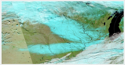
Fig. 5. Taken from: https://earthdata.nasa.gov/worldview/worldview-image-archive/bands-of-snow-in-iowa-usa
With another example, we can identify recent burn scars in southern Florida because this method enhances how we see vegetation. For example, consider these two images (6a and 6b) as taken from this website.
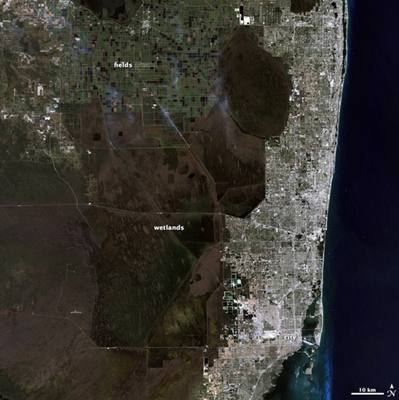
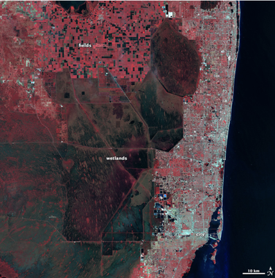
Fig. 6a. RGB, true-color image, using red, green, and blue bands Fig. 6b. False-color, using shortwave infrared, red, and green bands
Here you can see how the green vegetation in the true-color image more clearly stands out in the false-color image, which can be more useful for studies investigating, for example, small tree-islands in the wetlands(notice the small red slivers scattered throughout the wetlands in the right image).
Suddenly this opens up the possibility for a large number of interpretations and purposes for false (different)-color satellite images, and many of these can be made as a way to grab viewers’ attention while simultaneously presenting them with information that otherwise would be difficult to explain.
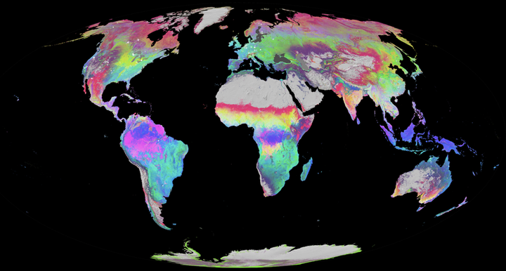
To better give an idea of this, Josh and I made a map for my recent poster at the CNR Graduate Research Symposium here on campus, where I presented the flux and MODIS work that Xiaojie and I worked on last term (read here to find out more about it).
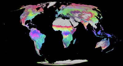
Fig. 7. MODIS phenometrics
I was confused for a while about what I was seeing until I asked Josh to explain it at the basic level. First of all, the data underlying this image are from the MODIS MCD12Q2 Collection 6 product, which measures land surface phenology (the timing of vegetation life cycle events) across the whole world at an annual timescale. This product can tell us, for example, the timing of peak greenness or spring leaf-out at any location around the world. Overall this is indicative of this approach’s utility, as there are few (if any) other ways of visualizing multiple data sources at once. With one command that can take seconds to run, we can see the interactions of 3 separate analysis topics.
Because this particular map is from a product as opposed to the satellite instrument itself, it does not contain the same wavelength bands. Instead, the bands it contains as a raster are the different bands created after the instrument data was processed – in other words, for this specific product, the bands are the annual, phenometric thresholds: greenup, mid-greenup, peak, senescence, mid-greendown, dormancy, EVI2min, EVI2max, EVI2area (see image below). However (!), plotting these bands onto a map requires the exact same steps as with a normal satellite image, and interpretation is the exact same as well.
Let’s look at this map again. It looks pretty cool, and honestly I’ve spent a good amount of time just staring at it. But ultimately what do we need to understand this? A simple caption explaining what was assigned to the RGB slots of the “plot” function. In this case, it was R = peak, B = EVI2min, and G = EVI2area. Ok, so now we have an idea of what we’re looking at, but we need to be more specific, so let’s first look at one color by itself. Pure, bright red means high values of peak greenness (thus, late peak) and low values of the other bands. So what about areas that have no hint or low hints of red? It can be helpful to think of it as a color spectrum. Each RGB assignment gets a value between 0-255 corresponding to the amount of each color.
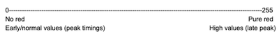
Areas on the map close to 0 red are indicative of early / normal day-of-year peak greenness estimates. These are the map portions that have little to no red, yellow, or magenta. Areas with pure red have late peaktimings, and this can be seen in the converse from above, including all areas that are red, yellow, and magenta.
Ok, so we know about single colors then. What about the mixed colors, like cyan? To that we turn back to the additive color wheel.
Cyan is the mixture of blue and green light. Here, pure green means high (large) EVI2 area, so a presumably productive area (one that’s green a good portion of the year / has many trees or crops). Pure blue is high EVI2min, which can mean a higher base productivity (e.g. evergreen trees are green year-round whereas deciduous have no green throughout winter). Areas on the map that are both pure blue and green are represented as cyan, which means they have both high EVI2area and high EVI2min, which is exemplified by the distribution of loblolly/mixed deciduous-evergreen forests in the SE United States as well as the croplands southeast of the Amazon. To help viewers of the poster internalize this and to better help myself remember how to explain things, I made a helpful color wheel showing this:
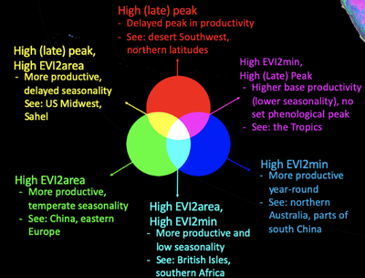
Fig. 8. Additive color and phenometrics
Let’s take another look at magenta, which is the combination of pure red (high [late] peak) and pure blue light (high EVI2min). This means areas that show up as magenta have a higher base productivity but also reach peak greenness later than other regions. Notably this is seen in the Amazon and higher latitudes where evergreen (broadleaf and needleleaf) forests reign.
So there you have it! An easy way to understand how to interpret a satellite / satellite product image. Hopefully in the future we will make even more maps like this (Josh is well-known for his maps here) and ultimately do our part to get more people excited about how great satellite and geospatial analysis can be.
And finally, here’s the full poster that was presented.
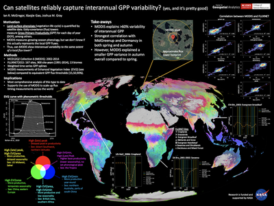
Fig. 9. Full poster
Ian McGregor
he/him/his
PhD Student, 2019-2023
I am a PhD candidate with the Center for Geospatial Analytics at North Carolina State University.