Fluxes!
Hi everyone, Ian and Xiaojie here. We wanted to give you a behind-the-scenes look at some of the research we’ve been collaborating on together for Josh. This example comes from last semester.
As part of the research assistantship we get with CGA (Center for Geospatial Analytics), we devote part of our weeks to helping out Josh with his own research, usually involving phenology and consistent with our own expertise. The first main idea that involved both of us revolved around Josh’s want to see how MODIS-derived phenometrics correspond with locally-derived phenometrics from flux towers (for a quick summary of phenometrics, see Ian’s article about phenometric edge effects!). In other words, does a large-scale characterization of carbon fluxes match up with small-scale measurements? In other other words, how good is MODIS at capturing fine-scale fluxes?
Though it seems like this could be easily answered with a regression line between MODIS and small-scale flux measurements, reality quickly proved this was not the case. For one, while MODIS data is easy to parse through and identify values per pixel, the flux data is a bit scattered. We used the FLUXNET2015 dataset, which is a standardized conglomeration of a subset of flux towers from around the world. This product has measured fluxes of NEE, GPP, and a whole host of variables for half-hourly timescales, with larger timescales scaled from that.
Essentially this quickly turned into a question of what variables we considered useful, and which specific ones to use. For example, there isn’t just one GPP measurement; instead, there’s GPP_CUT_REF, GPP_VUT_REF, GPP_CUT_MEAN, and etc. for another 25 variables. A literature review yielded three important findings: 1., the previous FLUXNET dataset (2007 La Thuile) didn’t include this variety of variables; 2., the descriptions of the different pre-processing methods almost seemed to be unnecessarily complex; and 3., helpfully, almost none of the previous studies that used FLUXNET data specified which GPP or NEE variable they used.
Thus, our quick regression became a long foray that was narrowed down to these steps.
- Create a sensitivity analysis of the various NEE/GPP variables to see how different each one was from each other.
- Depending on what we found from the sensitivity analysis, make plots of each site-year’s splined NEE/GPP values (close to 900), accounting for southern and northern hemisphere differences in seasonality.
- Identify thresholds as percentage of peak GPP, and extract the day of year corresponding to each threshold. Specifically, these are 15%, 50%, 90% and 100% GPP.
- Apply regional fixes as needed (i.e. when southern hemisphere needed different day of year calculation to match the northern hemisphere)
- Create preliminary regression, return to methods and update with fixes.
- Determine the final list of sites that aren’t usable due to missing / bad data.
- Extract MODIS phenometric values from the pixel in which each of the 167 flux towers are located.
- Create final regression, and interpret results for how good MODIS is.
Although this list seems like a straightforward way of determining the final results, we can say resolutely that this was not the case at all when we were in the middle of conducting the research. As with most science, our presentation of a linear train of thought is in reality indicative of a spaghetti mind map that made sense in the moment but would require 2 pages here to spell out everything. There was certainly a lot of trial and error with this research question. At least with Ian’s part of the research, this led to building a very large loop in R that has perhaps too many conditional statements (but it gets the job done!).
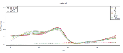
That being said, our results were a little surprising. When I (Ian) did the sensitivity analysis, I expected some of the variables to stand out as much better than the others. Instead, I found the following plots, essentially confirming that it didn’t matter which variable we used.
In the figures below, the smaller curves are the two NEE variables, while the larger ones are the GPP variables


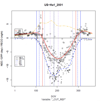
The bulk of the results involved creating the splined variables over the different site-years. Here’s an example from Harvard Forest (arguably one of the best ones for the northern hemisphere, and from Kruger National Park in South Africa (representing the southern hemisphere). The vertical lines show the different thresholds identified separately for fall (prior to GPPmax [100% GPP]) and spring (after GPPmax). After creating these plots for all of the nearly 900 site-years for which we had data, we extracted the day of year pairs for each threshold, and compared to MODIS.
Please disregard my (Ian’s) terrible placement of the color legend. Red is NEE, blue is GPP, and yellow is RECO (respiration).

Not all of the plots were good, though. Some of the flux time series per year looked like this cropland example from Italy, often attributable to different crop regimes but sometimes – inconspicuously – related to missing data.
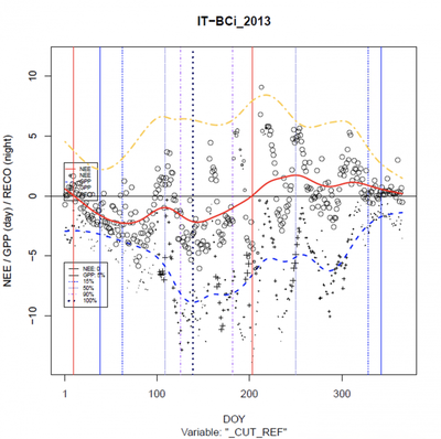
There were several sites like this one that were puzzling us as to why the plots were so different, until we finally realized we hadn’t quantified the amount of missing data per site. Suddenly we had a much better picture of what was going on at some of the sites.
Larger bars are indicative of only 1 month in a year having missing data. Smaller bars are thus representative of several months within a year missing data. Notice the prevalence of missing data in sites like US-Var (the group of green bars in the bottom middle).

As for MODIS phenometrics, we extracted phenometric values corresponding to flux site locations from the MCD12Q2 product using the AppEEARS tool provided by USGS. This product stores all the phenometrics of a pheno-cycle based on when the peak EVI value identified. For example, if the green-up (aka onset of greenness increase [OGI]) happens in December 2010, but peak EVI value is identified in March of 2011, then all the phenometrics will be stored in the MCD12Q2 layer of 2011. Therefore, to make the comparison with flux sites reasonable, we considered three years of MODIS layers simultaneously.
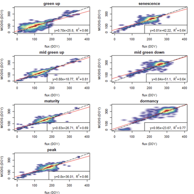
In total, our regression with MODIS ended up looking like this, with all r-squared values >0.6, and the highest sitting at 0.74. According to Josh these were better results than he thought we would find, and indeed it is surprising. MODIS has pixel sizes of 250m, which means that when you’re looking at measured values for a pixel, you’re looking at an aggregated measurement that covers all of that 62,500m2 square. Flux towers, on the other hand, usually have a footprint associated with their data that is dependent on prevailing wind patterns and vegetation structure. Thus, while at some sites the data could be hyper-local, most agree that footprints are often a few km, which is even larger than the MODIS pixel.
All this is to say there are complicated scaling issues that at first glance don’t seem as if they’d result in this high correlation. And yet, we do see results like this, covering multiple biomes around the world. We are pretty excited as it’s the first time this kind of assessment has been done and, perhaps as important, this is the first time someone has run a sensitivity analysis on the FLUXNET variables that clearly shows the (non-)difference between them. Hopefully future researchers can at least use this as a starting point so they aren’t as confused as we were.
So what’s next for us? We hope to make a paper out of this soon, but at the very least we’ve submitted our results for attendance at the May IALE-NA meeting in Toronto (International Association of Landscape Ecology – North America). If you’re heading out that way, you might see us there!
Ian McGregor
he/him/his
PhD Student, 2019-2023
I am a PhD candidate with the Center for Geospatial Analytics at North Carolina State University.